Vivest
Save smarter. Grow stronger.
A landing page for a savings app that keeps money in digital dollars, built around one job: getting a first-time visitor onto the waitlist.
- Role
- Web design, front-end build
- Year
- 2026
- Type
- Concept project
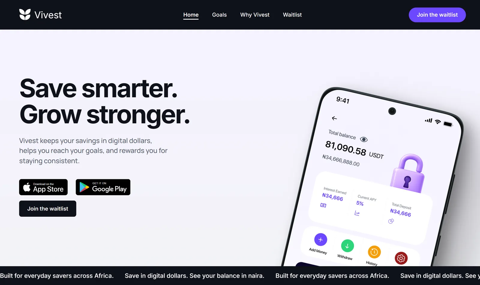
Showcase
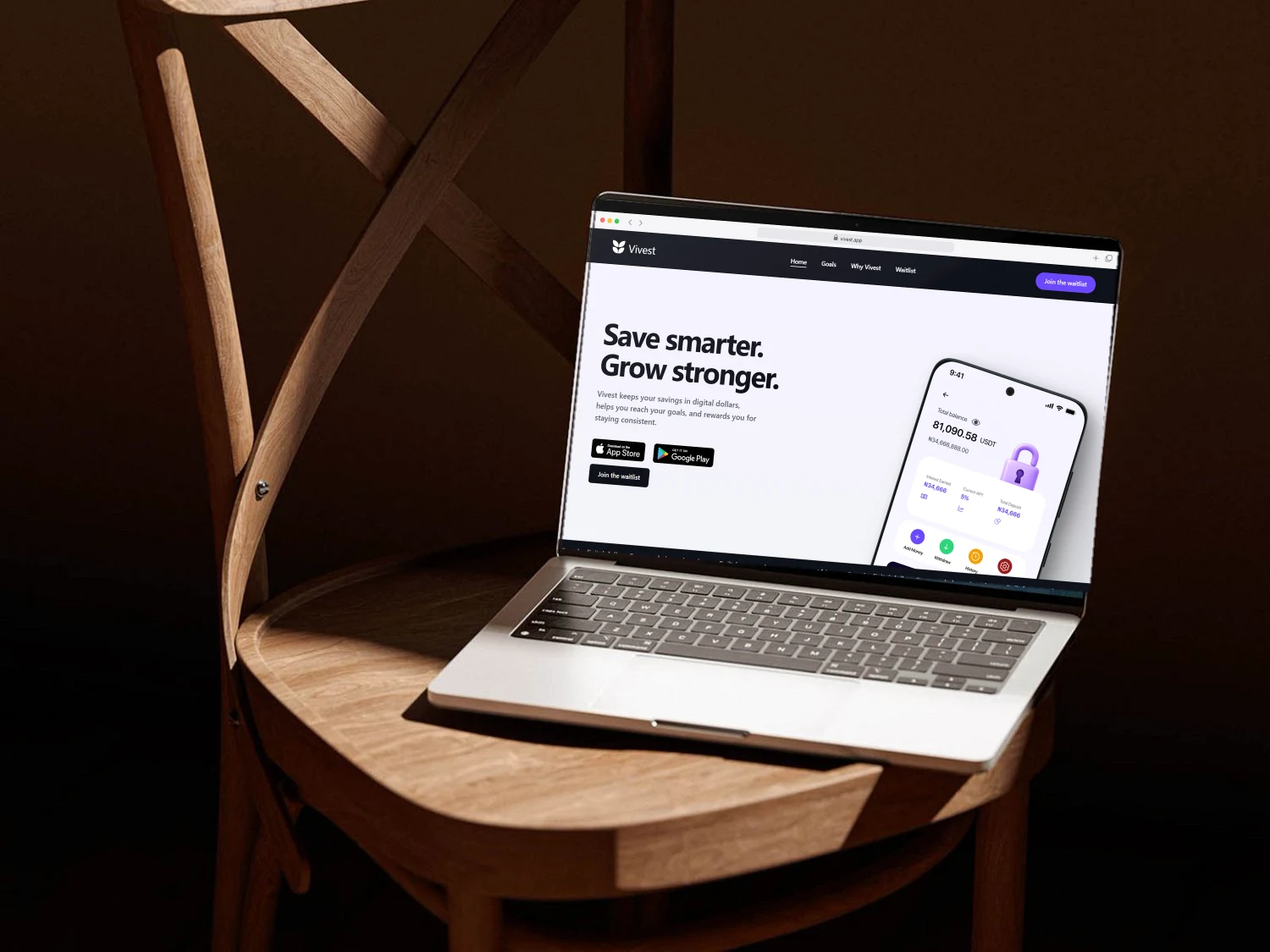
Approach
A finance page has to earn trust before it asks for anything.
The first version looked finished but left the visitor guessing: badges that promised a download, claims with nothing behind them, long stretches with no next step. The redesign answers the obvious questions in order, keeps one clear action, and lets the product screens do the persuading.
- Plans · Flex, Vault and Circle
- Goals · a target for every deposit
- Security · three plain proof points
- Questions · answered before they are asked
Colour
- Purple#6C47FF
- Ink#0F111A
- Slate#555B6E
- Green#2ED47A
- Lilac#F5F2FF
- Paper#F3F4F7
One purple carries the brand. Ink and paper do the reading work, and green appears only where safety is the subject.
Type
Aa
Inter
Manrope
Every dream starts with a goal
Sentence-case headings at 52px, body copy at 16 to 20px in slate, on one seven-step scale.
The page
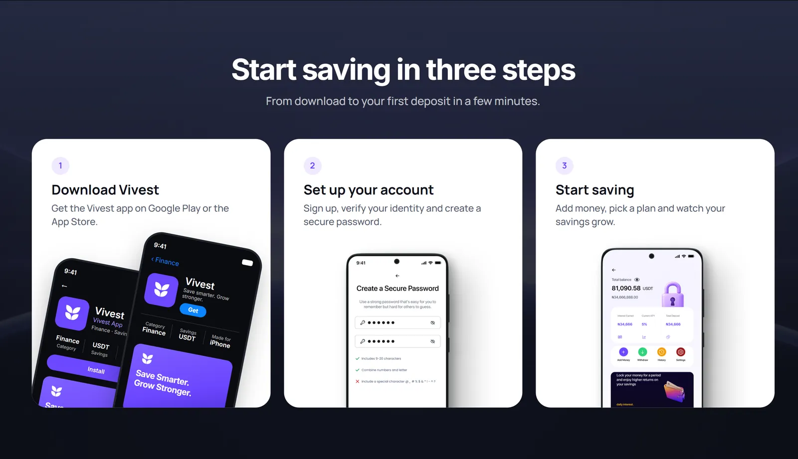
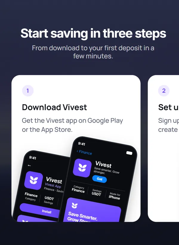
Three steps
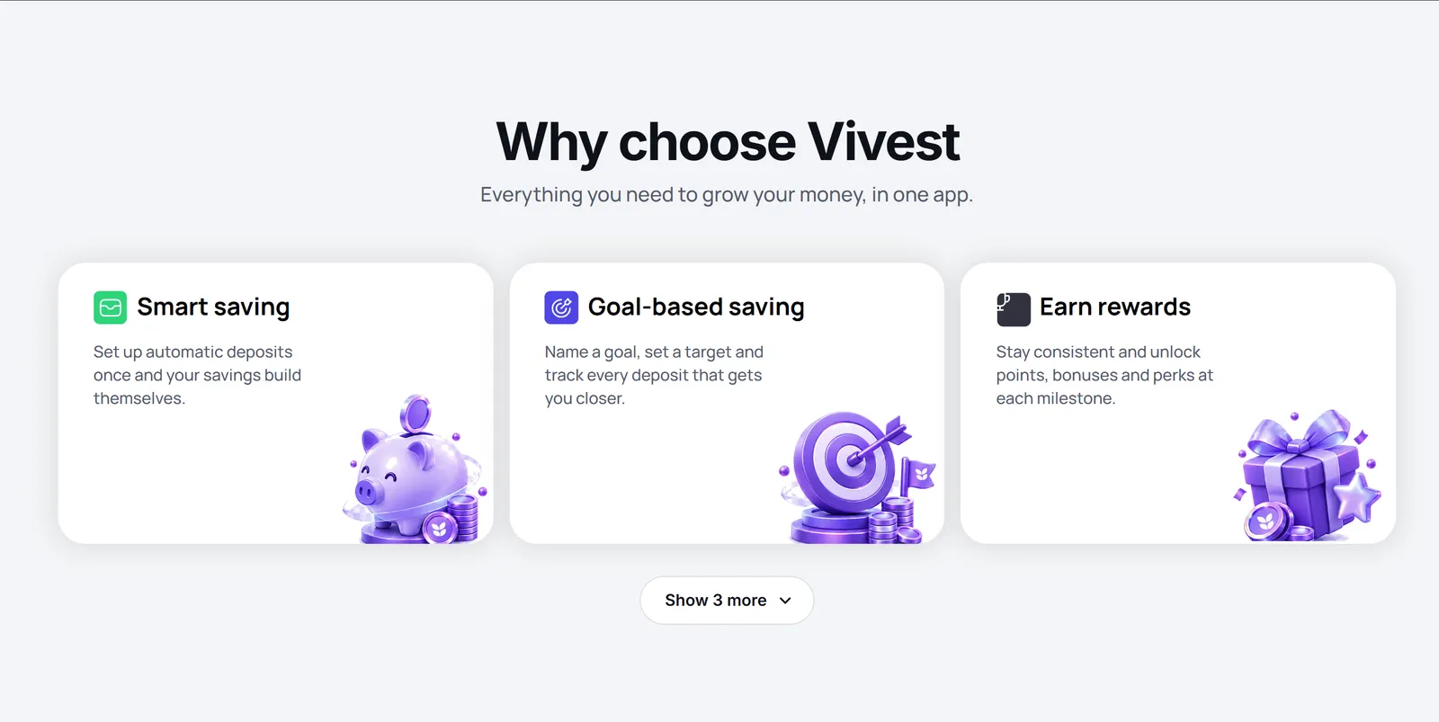
Features
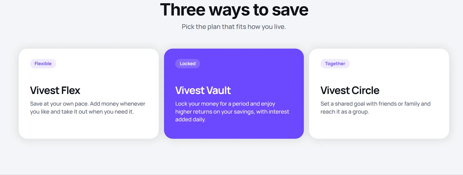
Plans
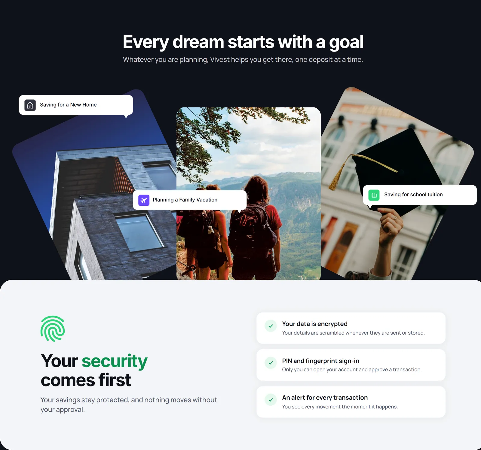
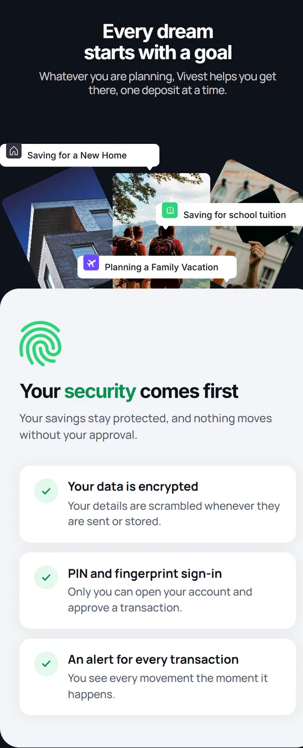
Goals and security
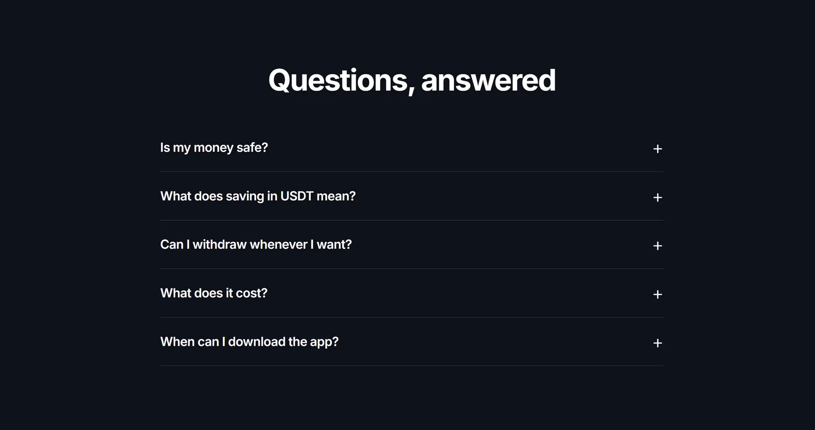
Questions
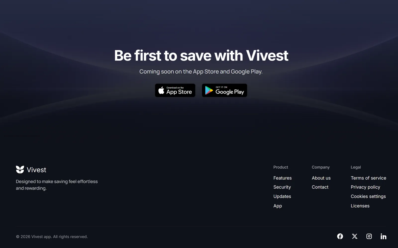
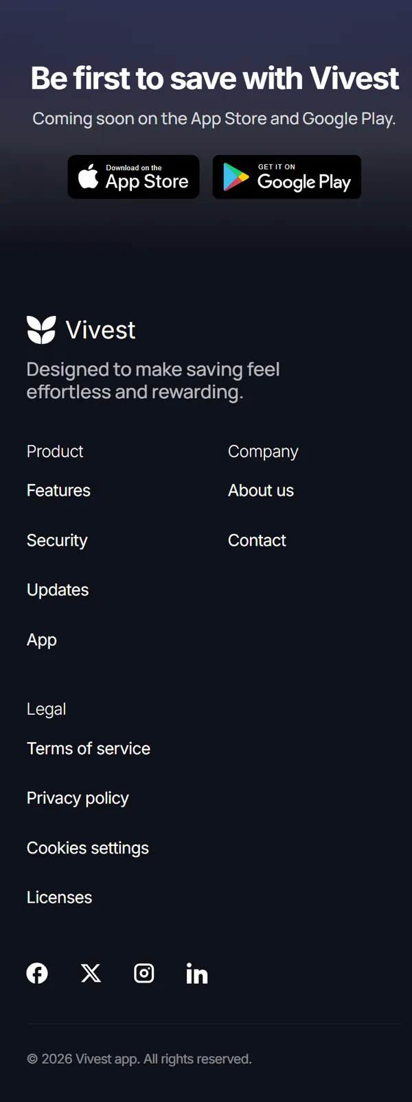
Close and footer
On a
phone
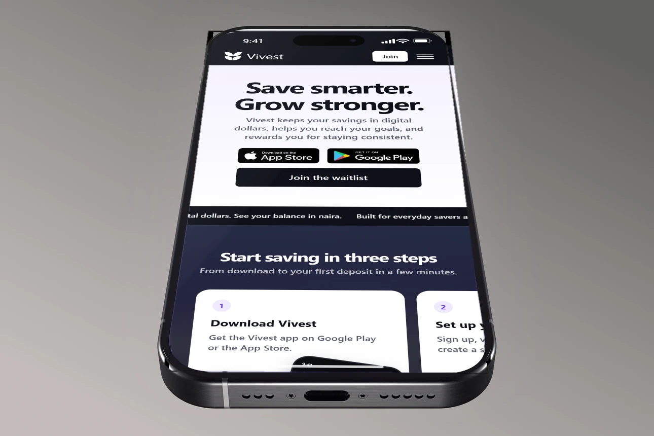
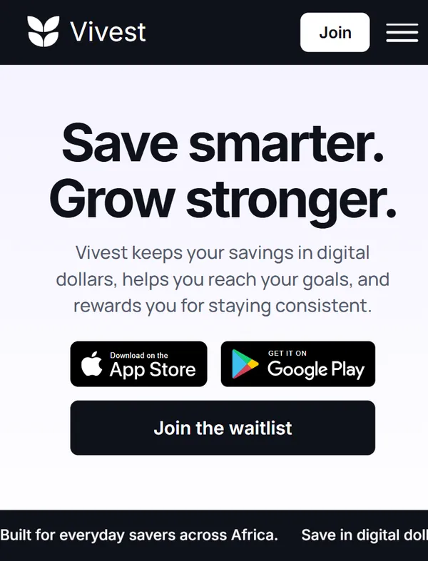
The phone page is the same design, not a second one.
Cards keep their proportions, the three steps stay a left-to-right row, and the menu opens as a full page with one action at the bottom.
Want something like this for your product?
Design, copy and build, handled by one person.